Here are some figures I have prepared to explain concepts in my course material on visualization.
I'm making them available to others who may also find them useful.
Crediting the author of these figures (Michael McGuffin) would be nice.
Click on an image for an enlarged version.
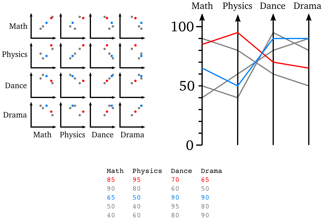
Above: 5 students, each having marks in 4 courses,
listed in the data table at bottom center.
One student is highligted in red, another in blue.
Above left: a scatterplot matrix, or SPLOM.
Above right: parallel coordinates.
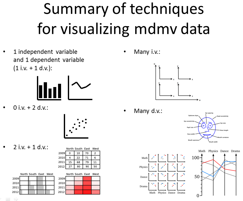
Above: techniques for visualizing multidimensional multivariate (mdmv) data.
"Multidimensional" refers to there being multiple independent variables
in the data,
and "multivariate" refers to there being multiple dependent variables.
If there is 1 independent variable and 1 dependent variable
(1 i.v. + 1 d.v.), we can use a bar chart or line chart
to visualize the data.
0 i.v. + 2 d.v.: a scatterplot.
2 i.v. + 1 d.v.: a table of numbers, table of bars, or heatmap.
Many i.v.: recursively subdivided axes,
as in Polaris and Tableau software.
Many d.v.: glyphs (such as Chernoff faces),
scatterplot matrix (SPLOM),
or parallel coordinates.
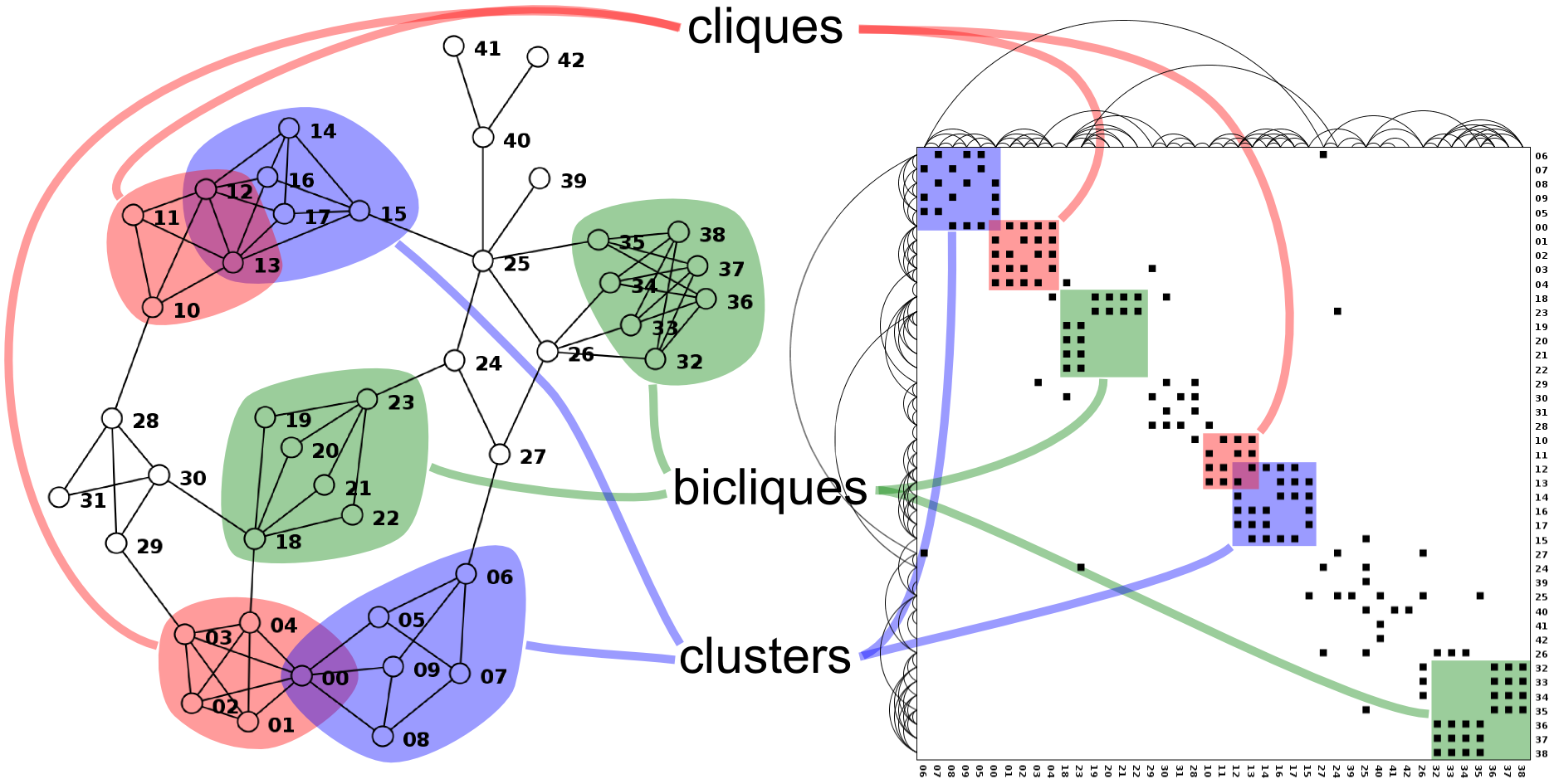
The above figure is published and explained in
my 2012 article
Simple Algorithms for Network Visualization: A Tutorial.